Millennium 2020
Corporation Website:
Millennium Arts & Crafts


Summary
Nanning Millennium Arts & Crafts Stock Co. Ltd. is an acrylic production enterprise in China, committed to the promotion and application the high quality and transparency resin and acrylic products. The company has implemented the long-standing strategy of resin industrialization and developed multiple market segments in phases.
I led the project to create this corporate website while I worked in the company. It is a content-driven platform that provides in-depth information about vision and technology to current and potential clients. Technical businesses like this need such media to offer additional resources, save a lot of time for a consult and build up trust, by doing so to contribute to expansion, growth, and increased business profits.
Client
Nanning Millennium Arts & Crafts Stock Co. Ltd.
Role
UX/UI design
Platform & Timeline
Website
4 Month
Team
1 Project Manager
2 Designers
1 Copywriter
2 Developers
Understand the Brand
Visual Identity
In order to make sure that I adhered to company’s current brand VI, I spent some time to look though the print collateral and digital properties that company owned. Luckily, I was able to summarize some takeaways around existing visual assets despite the lack of official guidance.
Color Palette
#b82e33
#ffffff
#222222
Visual Element
Logo

Visual element
Brand Culture
As an additional measure of creating well-rounded branding, we dived into newsletters, social media, and official communications like advertising to understand how the customers perceive the brand, what are the brand’s personality traits and brand voice.
Millennium focuses on research and development with strict self-discipline and professionalism while pursuing an open-minded and creation freedom. They have a brand voice that is formal and innovative.
We summarized key words that surround our findings to lead through the design process:
Strict
Positive
Innovation
Ambitious
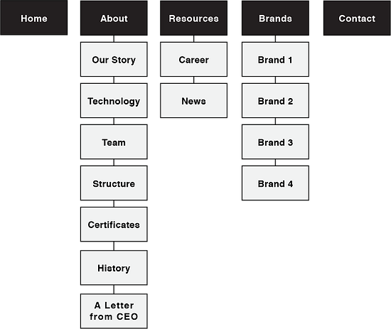
Information Architecture
One of the main constraints of this project is to create hierarchical information architecture based on the text contents and photography provided by the marketing department. I needed to organize, structure and label the given bulky information in effective way for visitors to find information easily.
Having never formally designed IA with such large amount of content before, my main source of inspiration was from samples of the other tech company websites that were dominating their industries.


While analyzing the different brands that successfully organize their information, I was able to find some patterns that could be use for reference in our case. Here you can see some of the iterations that we explored.
Iteration Feedback
The first IA draft was presented to the project manager.
-
“The information that introduces company should be subdivided into more pages”
-
“Technology contents are important, make it accessible easier”
-
“We may need 6 categories”

User Test Feedback
The second draft was tested with some participants and we found following problems
-
Participants had trouble to find technology related information because of the ambiguous labelling.
-
Participants didn’t able to find brand culture directly.
-
Participants got confused about the certificates types.
The final version if IA was determined after reorganized based on the test feedbacks.

Prototyping
As the IA and task flow became more and more clear, I began wireframing the solutions. The purpose of the mid fidelity prototyping was preliminarily to ensure hierarchy, visual expression, positions of components, and particularly provoke new ideas and suggestions from stakeholders.
Based on our research and analysis, we would employ a presentation style with wide size images consisting keywords to drive the experience. In terms of the pages focuses on text information, we leaved it with bare texts to keep a concise interface avoiding reading burden caused by overwhelming visual elements. I displayed some main pages below.
Home

Home (Drop-down menu)

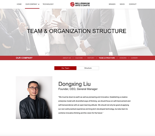
Our Company - Team & Structure

Technology

Technology - Technology Detail Page

Brand

Brand - Brand 1 Detail Page

Final work
We want to create the website a professional and positive look while gives off the impression of reliability. To fit those requirements, we decided on applying red and white as our two primary colours in the visual design. In terms of layout, we decided to use big blocks and concise structure to arrange information.
Home
The final homepage provides visitors an overall picture of the corporation image emphazises on visual communication to appeal further exploration.

Our Company
This category mainly provides informative contents with heavy text for visitors who really want to learn more about the background, vision and mission, history and etc. in details. 3 levels of hierarchal navigation allow viewers navigate through the intended contents.
Technology, Brand
The content under this category were some valuable information the company want to displayed about business. It was clearly classified into sub categories for visitors understand the context and target the information easily.

We also provide responsive solution to respond to the user’s behavior and environment based on screen size, platform and orientation for better experience.


Conclusion
This project was one of the corporation website projects that I’ve been directly a part of. I was able to dive deep into the discipline of information architecture create and reorganize effective information searching flows based on the feedback. What I learned was that when designing IA, most of my time went into thinking about the potential solutions, users’ journeys, and what parts of the structure could be elevated that make more sense to visitors.
Working with an already established brand challenged us to constantly think about the brand and consider the way to integrate the brand voice and VI into the design. However, I learned a lot from that about keeping consistency off the brand image to build a recognizable personality, meanwhile, tailor the design according to actual use.